


Earliest Sans-Serif Typefaces
This blog post describes two of the earliest documented English (Latin alphabet or Roman) sans-serif type designs. The first is somewhat obscure, but still more widely known: Caslon Egyptian or Two-Lines English. The second is even earlier and more obscure, which I am calling Soane Old Roman, based on a tiny sample sketch by John Soane which was discovered in the twenty-first century and discussed by James Mosley and the late Justin Howes.
Caslon Egyptian, 1816
or Two-Lines English Egyptian

Some resources about this typeface, the earliest commercially available sans-serif typeface.
- Wikipedia entry on Caslon Egyptian.
- Jonathan Martin’s article on Behance: Two Lines English Egyptian Digital Revival. This is where I got the high-resolution scan of the sample from the two-century-old type specimen book. His typeface is not publicly available for download or purchase, although if you contact him privately he may take your money.
- Fonts in Use has an article about...
- ... Font Bureau’s Caslons Egyptian revival, with its invented lowercase.
- Jonathan Morgan and Adrienne Vasquez made a revival which is available for purchase.
Soane Old Roman, 1779
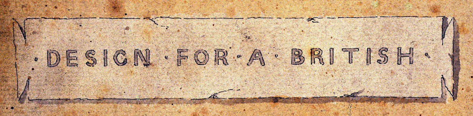
James Mosley published a scan of a type sample from a sketch dated 1779 for a proposed “DESIGN FOR A BRITISH” museum by architect John Soane. From these thirteen letters (plus two, if you take C from G and P from R) we can create the better part of an alphabet.
So now we have an even older typeface from the dawn of sans-serif types. If we fill in the gaps of Old Roman with Caslon Egyptian, we have a complete sans-serif uppercase alphabet older than the US Constitution.
2021 Soane Old Roman revival by Jared Updike

I made an experimental typeface (all uppercase, very few glyphs) that I created from Jonathan Martin’s reference scan, which combines Caslon Egyptian (capitals in this file) and Soane Old Roman / New Roman (lowercase in this file.)
- Download the OTF here. Available under the SIL OFL. If you make any changes or make something interesting from this, you must make the changes available under the same license, and call it something different. And please let me know about it!
For a comparison, including the lovely and quite popular Proxima Nova by Mark Simonson, see this table below:

(All of the black glyphs are available in the Soane Old Roman Bold OTF file.)
Conclusion
Just buy and use Simonson’s gorgeous and professional Proxima Nova family, or if you want it to be more historical (mostly, besides the capital letter G) get the Caslons Egyptian family from Font Bureau.