

Reference

The Origins of the Keyboard Layout

How the familiar pattern of seven natural keys and five raised keys took shape on medieval organs, and one of the few medieval keyboards that survives today. Text produced by Claude Opus 5.5, lightly edited and augmented.

Seven, to Seven + One, to Seven + Five

The 12-note keyboard, with seven natural keys plus five raised keys per octave, was not invented in a single moment. It developed gradually on church organs and took recognizable form around the mid-1300s. By the time the clavichord and harpsichord appeared in the 14th and 15th centuries, they inherited a layout organ builders had already worked out. The modern design of our piano keyboard (dating to the pianoforte of Bartolomeo Cristofori of Padua, Italy, 1726 or so) follws this scheme.

When All 12 Notes Appeared

The chromatic notes were added to the keyboard one at a time, largely because organs had to keep up with how singers were already performing.

Period Development
Before c. 1100 Medieval organs were played with sliders or wide levers rather than narrow keys, and were mostly diatonic.
11th–12th centuries B♭ became the first "extra" note. Medieval music theory already treated it as a regular note alongside B♮.
13th–early 14th centuries Other chromatic notes (F♯, C♯, E♭, G♯) were added one by one.
c. 1360 Complete chromatic octaves were in use. The Robertsbridge Codex, keyboard music from about this time, uses essentially all 12 pitch classes.

Why the extra notes were needed: Singers routinely raised or lowered certain notes to avoid harsh intervals or to strengthen cadences, a practice known as musica ficta. Organs that accompanied or alternated with choirs needed those pitches as well.

An exception that lasted for centuries: The bass was often left incomplete. The short octave omitted rarely used low sharps to save pipes and money, and it survived into the 1700s.

When the Two-Tier Layout Became Standard

Having 12 notes is one thing. Arranging them as two tiers, with raised keys set back between the naturals in groups of two and three, is another.

  • Wide early keys. Early organ keys were wide and stiff, sometimes pressed with a fist. Michael Praetorius, writing in 1619, described the keys of the Halberstadt Cathedral organ (1361) as several inches wide. Even so, that organ already placed its chromatic notes on a separate upper row, an early form of the two-tier design.
  • Narrowing for fingers. During the late 14th and 15th centuries, keys narrowed enough to be played with individual fingers. The raised keys were shortened and set back, sitting between the naturals in the grouping we know today.
  • Fixed by about 1440. Henri Arnaut de Zwolle's treatise from around 1440 shows keyboards whose layout, apart from range and key sizes, matches the modern one.
  • Later experiments. The basic design stayed fixed from then on, though builders sometimes tried variations, such as split sharps in the 16th and 17th centuries that gave separate keys for D♯ and E♭.

Do Any Wide-Lever Keyboards Survive?

As far as is known, no medieval cathedral still uses its original wide-key keyboard. Organs were rebuilt, enlarged, or replaced every century or two as musical styles and technology changed, and the earliest wide-key instruments were among the first to go. Most of what we know about them comes from written descriptions and drawings, especially Praetorius's account of Halberstadt.

What does survive:

  • The Valère organ in Sion, Switzerland (c. 1430s) is often called the oldest playable organ in the world. It already has narrower finger keys, and its keyboard was modified in later centuries.
  • Two organs from Gotland, Sweden, are now in the Swedish History Museum in Stockholm. Only the case survives of the Sundre organ (c. 1370). The Norrlanda organ is far more complete and is described below.
  • Reconstructions of early instruments have been built for research and demonstration.

Watch Rob Scallon and Mr. Brink Play a Carillon

A living relative: The fist-played interface survives in the carillon, a set of tower bells played from a keyboard of wooden batons. Carillonneurs strike the batons with loosely closed fists, and the batons are arranged in two tiers like a piano keyboard.

The Norrlanda Organ

The section below is translated from the Swedish Wikipedia article "Norrlandaorgeln" (revision 58947054), licensed under CC BY-SA.

Overview

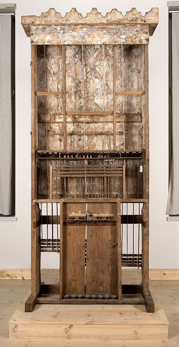
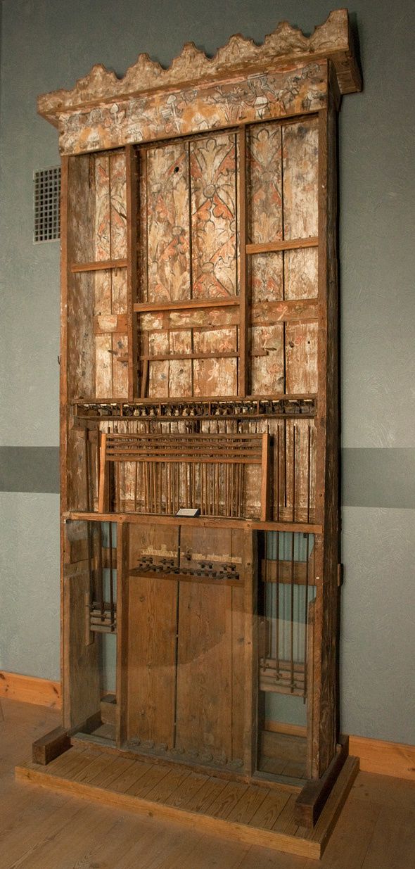
The remains of the Norrlanda organ are now kept at the Swedish History Museum (Statens historiska museum) in Stockholm. The organ formerly stood in Norrlanda Church on Gotland. It was built sometime between 1370 and 1430, which makes its preserved parts among the oldest in the world.
What Survives

The organ is nearly complete; only the bellows and pipes are missing. The following have been preserved:

  • the organ case
  • the key action, including its roller board
  • the wind chests
  • the pedal keyboard

How It Worked

  • Compass: 26 notes.
  • Key action: Each key was connected to a pallet (a valve) that let air into between three and five pipes at once.
  • Pipe layout: The manual pipes were arranged diatonically, with the pedal pipes standing on either side of them.
  • Sound: It was a mixture organ (Blockwerk). Every key sounded all of its pipes together, and the organist had no way to choose different registrations.

Technical Terms

  • Roller board (Swedish vällbräda): A mechanism that carries each key's motion sideways to the correct pallet when the pipes do not sit directly above the keys.
  • Mixture organ / Blockwerk: An organ without separate stops, so all the pipes belonging to a key sound whenever it is pressed. Later organs added stops so players could select among different sounds.
  • "Arranged diatonically": This describes how the pipes stood on the wind chest, not necessarily the layout of the keyboard. Organ builders often place pipes in a different order from the keys for balance and to save space.

Why It Matters

The Norrlanda organ is one of the very few places where a medieval organ keyboard and its mechanism actually survive. It is no longer in its church and can no longer be played, but drawings and a replica have been made from it, giving a rare direct look at how organs were built around 1400.


Programming

Animated Films Deluxe

In the past, I kept a text document listing animated feature films: to keep track of which ones I had seen, which ones I wanted to see, etc. Frankly, that was the wrong way to do this.

A Better Way

Better, up-to-date version lives here:

  • Animation gallery, using TheBrain 15's new Local API.

A better way is to use TheBrain, a highly flexible piece of software for keeping track of many different things, but in this case, for keeping track of feature films made by various studios. Here is a link to my publicly shared Animation brain where I have updated and expanded that old list, and more importantly, it's now much easier to keep up to date.

Pretty-Printing a Text Outline

Not only that, but I can make a wonderful gallery using TheBrain 15's new Local API.

For reference:

  • brain-gal, an open source project on GitHub that shows how to use templates and CSS to build a really nice gallery.

    • Also ships with a very useful Node script, local-brain-text-outline.js that can connect to TB15 locally and by specificying a local brain, it can fetch a giant outline of all your thoughts, types, tags, and URL attachments, starting from a given root thought, similar to the way TB14 and TB15 desktop have been able to output a text outline, but instead fully automated, on your live data, fast enough to be useful on demand. (Before I had to do this step manually with TheBrain desktop UI and it took way too many clicks to get the outline text file. Much easier with Local API support.)
  • TheBrain API reference

The scripts in brain-gal use another script outline2jsx.js to turn the outline into XML, and then another framework, Bray, converts this into a web page using carefully designed components. (However the right way to do this is probably to make a live web-app with React or Vite instead, and to skip the text outline entirely and just use the JSON responses from TheBrain Local API directly. My Bray-based code spits out a static outline, which is easier to host, but harder to update.)

Hopefully someone out there will find this useful or inspiring, to take on a data visualization adventure of their own.


Design

Junk Drawer Design Makes the World a Worse Place

In a moment of gratitude journal celebration, I went to record a few seconds of my son talking, in Voice Memos on my brand new iPhone 17 Pro. I simply wanted to Trim the audio, then add it to his Day One journal. It was a special moment. But instead, I had a real moment of distress and frustration. I nearly threw my phone against the wall. Something that should have taken five seconds (and always had, in the past) now took like five minutes, feeling like I was being trolled: the Trim button in Voice Memos was nowhere to be seen.

Never fear, Siri can answer questions about applications on the iPhone. Except Siri was just as confused as I was when I asked how to trim an audio recording in the Voice Memos app. It never said to hit the Edit button, and then the Junk Drawer DOT DOT DOT button on the top left, and behold, egregious animation would reveal the sacred Trim button, which I eventually had to figure out on my own, after I almost butchered the audio recording itself. Instead Siri simply said to tap on the ICON THAT LOOKS LIKE A NATURAL SYMBOL IN MUSIC NOTATION. Which wasn't there. Which is why I asked Siri for help in the first place. Then I asked again and it said to hit the Trim button. Which was not there. I felt gaslit and confused.

Most people make the mistake of thinking design is what it looks like. People think it's this veneer - that the designers are handed this box and told, 'Make it look good!' That's not what we think design is. It's not just what it looks like and feels like. Design is how it works.

— Steve Jobs

Let me spell this out in an actionable manner: making every action that I do all day every day (tap to see tabs, close a tab, tap to open a new tab on Safari) take 66% more taps (5 instead of 3) is unconscionable. It is not an improvement. Design is how it works, and this works worse, objectively. I would have stayed on iOS 18 on my iPhone 17 Pro if given the choice, and I knew all this beforehand. But Alan Dye did not even give me that choice, much less do his job to avoid making me wish I could even make that choice.

Invoking the ghost of Steve Jobs is always dangerous, but here I think if he had felt on iota of this feeling of frustration, he would have had it immediately fixed, or heads would have rolled. Instead Tim Cook thinks this stuff is great? What is going on? At first the changes with iOS 26, all that huge OS-visual-update-undertaking for almost no reason (see above quote) were merely eye-rolling. But now it's personal.

I usually don't wish anyone ill, especially not publicly, but there is a special cricle of hell in Dante's Inferno for interface designers who make things worse and then blow smoke up their own arse that they are making things better (having the gall to quote Steve Jobs, etc.), when they are clearly not improving anything—as proven by their shoddy voice assistant being just as confused as me. And I'm an expert user, a developer and close Apple watcher, I pay attention, I care about this stuff—if I'm confused, then think of the children!

As an Apple investor, I'm pleased to see Alan Dye leave, so someone with a clearer sense of intuitiveness (Stephen Lemay, you're our only hope) may have a sliver of a chance to bring Apple's OSes back to the level they were at when iOS 18 reigned. (As in, I could find a button I knew was there without wishing ill of the Software Design lead at Apple and wanting to destroy my brand new phone in a fit of righteous indignation. I know who to blame, and it isn't me. I'm not merely throwing a fit because a button moved. I'm pissed because a critical button was deliberately hidden for no reason (or wrong-headed, superficial, cosmetic reasons) and Siri wasn't even updated to tell me so. From my point of view, the functionality might have been removed—who knows maybe Alan Dye hates computers and would maliciously remove functionality?)

But I also want to see Tim Cook move on as CEO as well, because the Siri-Being-Truly-Awful Problem (well documented for mahy years by much smarter people) is all on Cook as well. As an investor, I want to see excellence, not excuse making. I'm tired of some of the higher-ups at Apple being oblivious to the backsliding in Apple's software quality, and Siri being 5-10 years behind, for like 15 years now.

This is not about aesthetics or disagreeing about taste (another problem worth discussing). This is about making great software objectively worse and not being able to tell the difference. Multiply my five minutes of frustration by a million or billion users, and you get quite a lot of pointless, but real suffering, with only a few people to blame. Alan Dye, good riddance. And Tim Cook, you have done a lot of great things for Apple—thank you for your service—but the era of you holding back Apple's products, with your lack of taste, has come to an end.


Reference

Mel Blanc Voices Looney Tunes Characters

Every day somebody’s born who has never seen The Flinstones.

— Merlin Mann

Or in this case, Looney Tunes! We began rectifying this last night by watching our first Bugs Bunny, etc. with the kids. (By the way, Mel Blanc does the voice of Barney Rubble on the Flintstones.)

Main Looney Tunes Characters

All Voiced By the Same Amazing Actor

Mel Blanc, the Man of 1,000 Voices, brought all of the main Looney Tunes characters (and dozens of minor ones) to life, by the end of his tenure with Warner Brothers:

  • Bugs Bunny
  • Daffy Duck
  • Elmer Fudd
  • Foghorn Leghorn / Barnyard Dog / Henery Hawk
  • Marvin the Martian
  • Pepé Le Pew / Penelope Pussycat
  • Porky Pig
  • Road Runner
  • Speedy Gonzales / Slowpoke Rodriguez
  • Sylvester
  • Tasmanian Devil / She-Devil
  • Tweety
  • Wile E. Coyote
  • Yosemite Sam

The list I found has a lot of minor characters, so I focused on listing the main dozen or so characters, above, just to have a list of these, in one place.

More on Mel

According to Wikipedia:

Blanc is regarded as the most prolific voice actor in entertainment history. He was the first voice actor to receive on-screen credit.

His tombstone reads “That's All Folks,” a phrase utter by Porky Pig at the end of Warner Bros. cartoons, from 1937 to 1946.

There was voice acting before Blanc, and voice acting after. And he continued into my own lifetime, in the 1980s.

Archive